Show the level of detail the viewer needs to trust
Use real UI when the viewer needs to recognise a screen or follow a task. Use illustrated UI when the workflow matters but the full interface would bury it. Use abstract motion graphics for relationships or ideas that are not visible on a screen. A useful SaaS film can move between these modes, provided it never makes a simplified illustration look like proof of a feature that does not exist.
The decision is about fidelity: which parts must match the product exactly, and which can be simplified without changing the meaning? It is separate from choosing an explainer versus a demo, or choosing an AI tool versus custom production. Set the accuracy boundary before approving the visual style.
Sources: FDM: Explainer versus product demoFDM: AI versus custom SaaS production
What each visual mode can and cannot prove
Real UI means captured product screens, with editing, zooms or callouts as needed. It can show the current labels, order of actions and system response. It still needs review: a recording from the wrong role or an old build is real footage of the wrong experience. Remove irrelevant waiting without implying that processing is instantaneous.
Illustrated UI redraws selected elements into a readable visual sequence. It can keep an inbox, an approval card and a status change visible together. Preserve important labels, states and human decisions. Removing a sidebar is different from removing an approval requirement. A redraw is not permission to design a better product for the video.
Abstract animation uses shapes, diagrams or metaphors to explain an idea. It can show how information moves between systems, but cannot establish what a user will actually click. If a buyer needs interface evidence, an abstract sequence should lead to a real demonstration, not replace it.
Three examples you can inspect in FDM’s work
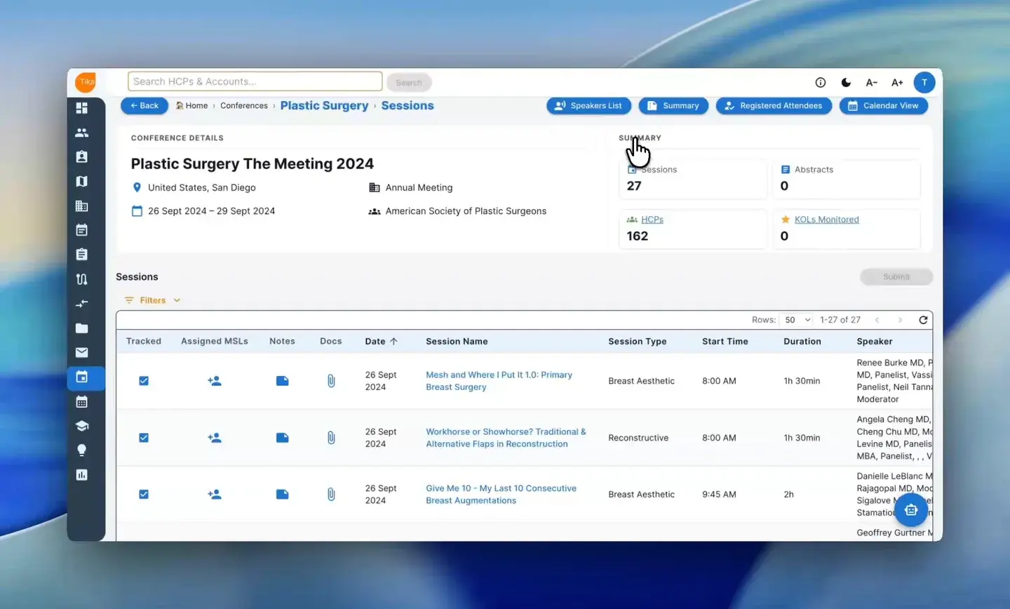
The TikaMobile conference-planning walkthrough shows the interface, cursor movement and successive screens. It is useful evidence of a task-led treatment. The relevant question is whether the viewer can follow the workflow, rather than whether the screen has been turned into an elaborate visual effect.
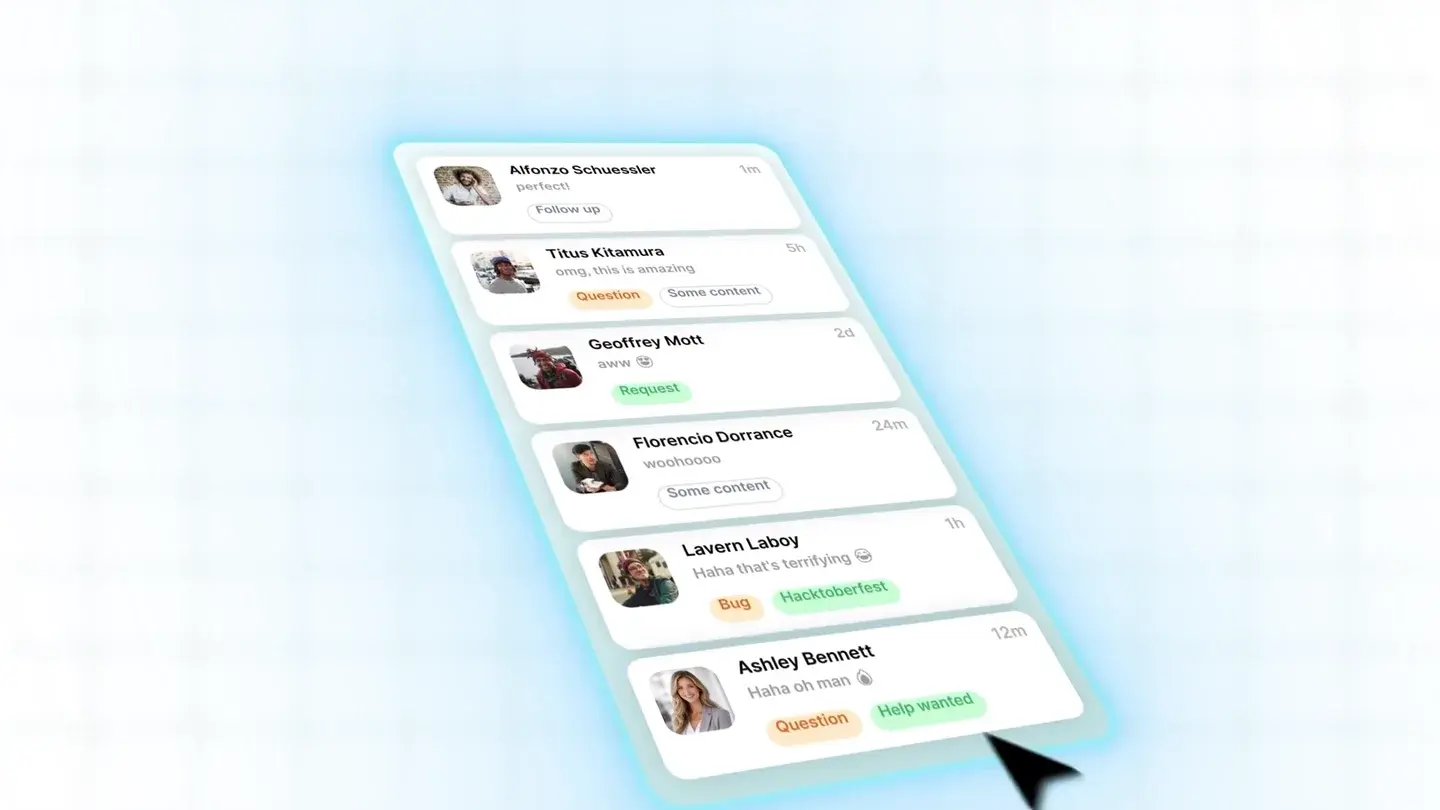
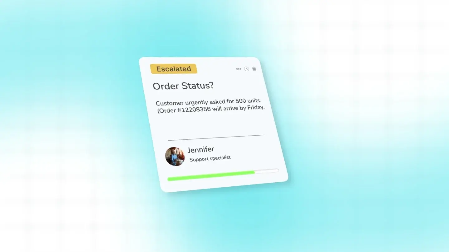
The Krista.ai email explainer uses familiar inbox and business-system cards to explain connections and approvals. Those designed cards are an example of selective visual explanation, not a pixel-for-pixel interface tutorial. In the separate Krista reasoning podcast cutdown, diagrams for understanding, reasoning and action explain a concept rather than a click path.
These examples support different production choices. They do not establish that one mode increased conversion, took less time to maintain or performed better with every audience. Watch them beside your own source material and ask which job your film has to do.
Sources: FDM: TikaMobile conference-planning walkthroughFDM: Krista.ai email workflow filmFDM: Krista.ai reasoning podcast cutdown
Choose scene by scene, not once for the whole film
A familiar category and an unfamiliar workflow need different amounts of context. An experienced administrator checking permissions may want the exact screen. A first-time buyer may need to understand why several systems are involved before a detailed capture is useful. Start with what the audience knows, then identify the moment that needs proof.
Placement changes the decision too. A small social placement can make a full desktop interface unreadable. A help article can support a larger player and a more deliberate demonstration. Test the actual embed size before approving a scene. If the critical label cannot be read, enlarge the relevant area or move that detail into a linked walkthrough.
The matrix below is a working decision aid, not a scoring system. If permissions prevent you from using a screenshot, resolve what may be shown before production. Redrawing confidential data does not make it cleared for publication. An unstable interface may justify a conceptual overview, but it does not justify presenting planned behaviour as available today.
A 75-second storyboard using all three modes
This is an illustrative storyboard for a fictional support-request product, not a Krista.ai script or a measured client result. The timings are a planning budget. Record a read-through and adjust them to the actual explanation before animation.
00:00–00:12: show three disconnected request sources as an abstract diagram. Establish the problem: someone must work out which team should respond. Do not show an invented product screen yet.
00:12–00:30: use illustrated UI to follow one request into a queue. Keep the request type, assignment rule and human decision visible; omit unrelated navigation. The product owner must approve that sequence and the labels.
00:30–00:52: switch to a real demonstration account. Show the assigned person opening the request and taking the approved next action. Use the same example across the transition so the viewer does not have to decode a second scenario.
00:52–01:05: return to a simple diagram showing the resulting status and where a person remains responsible. If something still needs review, show it as pending rather than completed.
01:05–01:15: invite the viewer to watch the full workflow or request a relevant demo. Choose one destination. A task tutorial would spend more of its time on the real screens; this overview deliberately does not teach every click.
What to request from the product team
Ask for a short guided demonstration of the exact workflow, not just a folder of attractive screens. Have the product owner explain the starting state, required role, meaningful transitions and exceptions. Save a reference capture so reviewers can compare the storyboard with the source.
For each scene, record the source screen or behaviour, the proposed simplification, who approves it and what would make it misleading. This is especially useful when a designer removes a warning or combines several panels to improve composition. Review the resulting implication, not only the wording.
Request these items before approving production:
- A safe demonstration account or approved captures with synthetic data.
- The relevant build, user role, prerequisites and current feature limits.
- Screens and labels that must remain exact, plus permission to use brand and third-party elements.
- Upcoming changes that could invalidate the sequence before release.
- One product reviewer, agreed review dates and an owner for later updates.
Budget for the parts that will change
Real captures can need replacement when navigation changes. Illustrated UI may survive cosmetic changes, but a changed role, status or capability can still invalidate it. Abstract graphics also age if the relationship they explain is no longer true. None of the three is automatically evergreen.
Keep the script, screen references and editable production files organised by scene, subject to the agreed handover. Mark the sequences that depend on current UI. Before commissioning, ask how a replacement screen affects narration, cursor motion, captions and neighbouring shots. Our demo-maintenance guide covers the register and update decisions in more detail.
Sources: FDM: Keeping product demos current
When a plain screen recording is enough
Use a straightforward recording when the audience already understands the product, the task is stable and the real sequence answers the question. A short spoken explanation, readable framing and checked captions may be all it needs. There is little value in redrawing a settings page solely to make an internal how-to look expensive.
Before buying animation, show the rough recording to someone who resembles the intended viewer. Ask them to describe the action and expected result. If they can follow it, spend the budget on correcting unclear audio or maintaining the tutorial. If they follow the clicks but misunderstand the larger relationship, add a targeted diagram rather than replacing every screen.
Approve the simplest accurate treatment for each scene. That leaves the creative work where it helps: revealing something the raw interface cannot explain on its own.
Sources and references
- Explainer versus product demo · FDM · Checked 2026-10-02
- AI versus custom SaaS production · FDM · Checked 2026-10-02
- TikaMobile conference-planning walkthrough · FDM · Checked 2026-10-02
- Krista.ai email workflow film · FDM · Checked 2026-10-02
- Krista.ai reasoning podcast cutdown · FDM · Checked 2026-10-02
- Keeping product demos current · FDM · Checked 2026-10-02